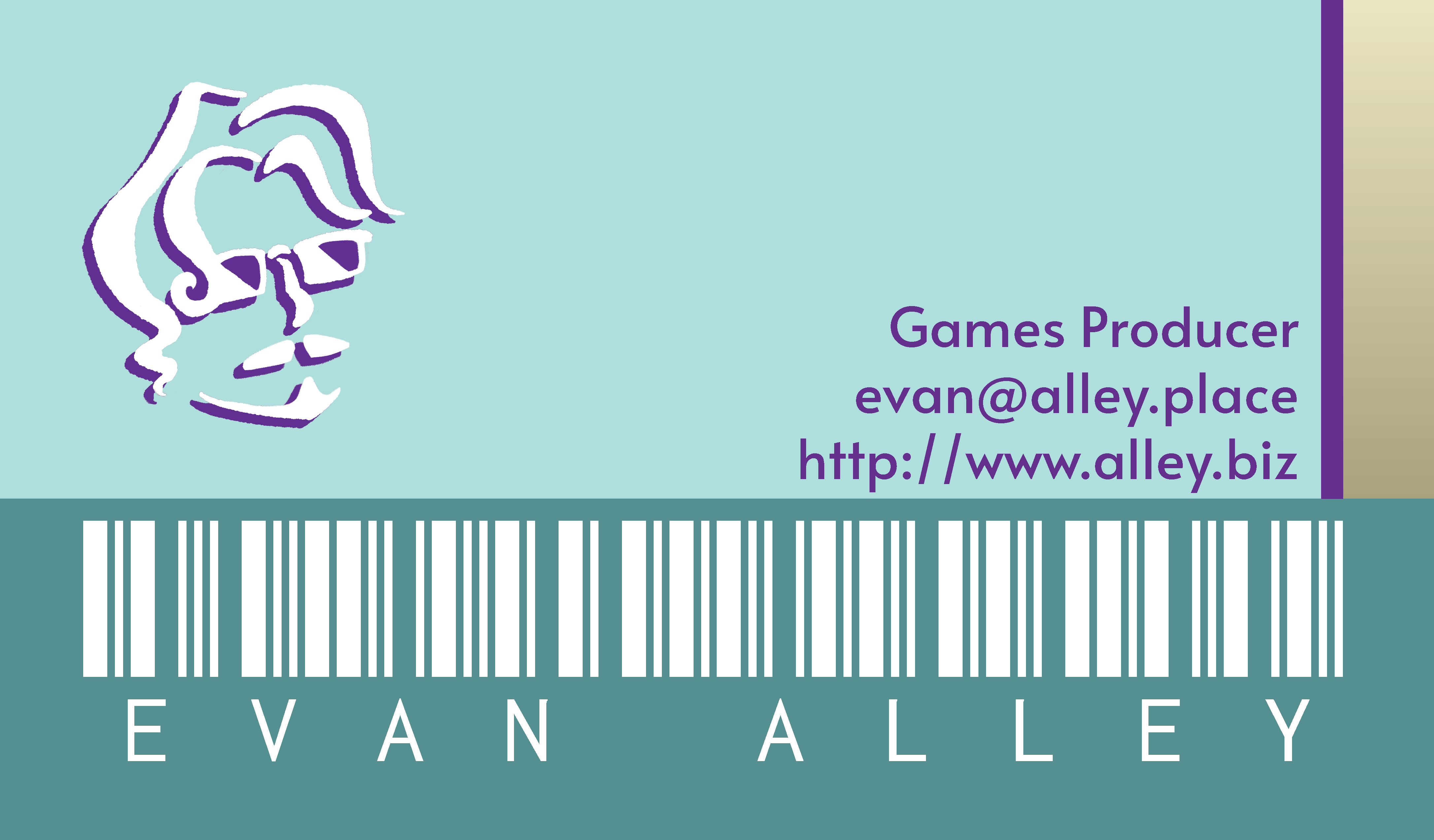
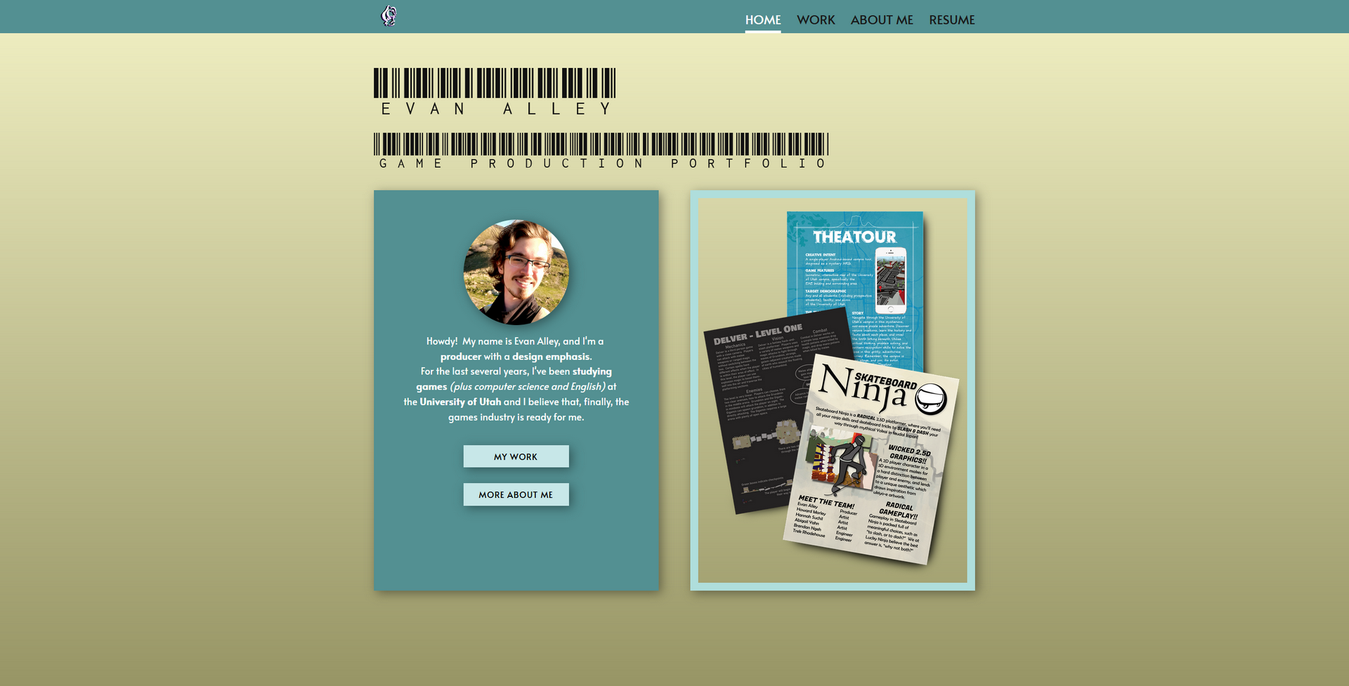
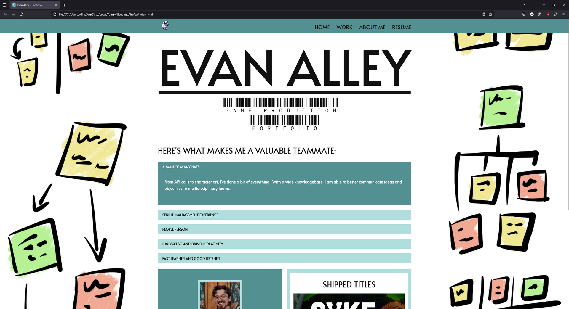
My website drives my brand, and it's been through several significant overhauls over the years, and many, many small iterations. The only things that have stayed the same are the text font (Alata) and that little spinning logo in the corner!
Once I had my brand established, I unified my social media presence with custom banners.
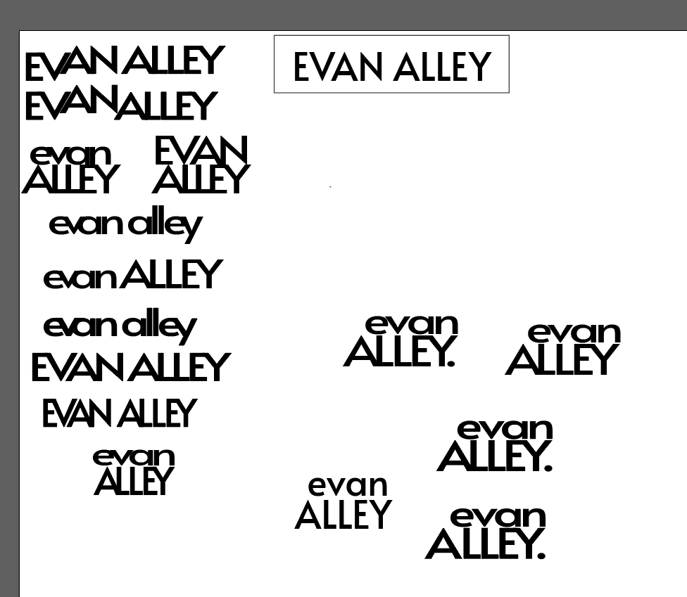
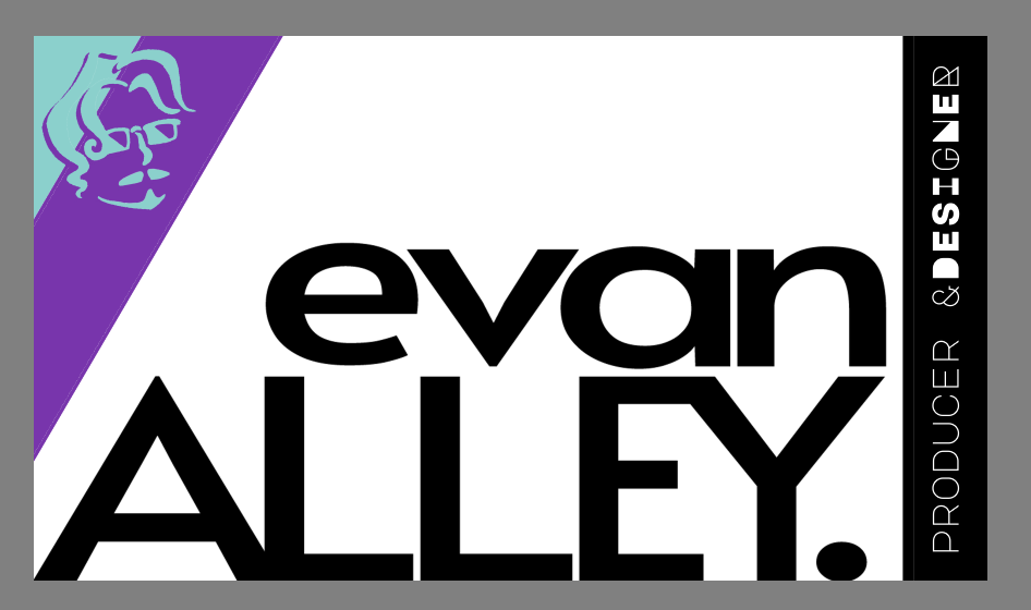
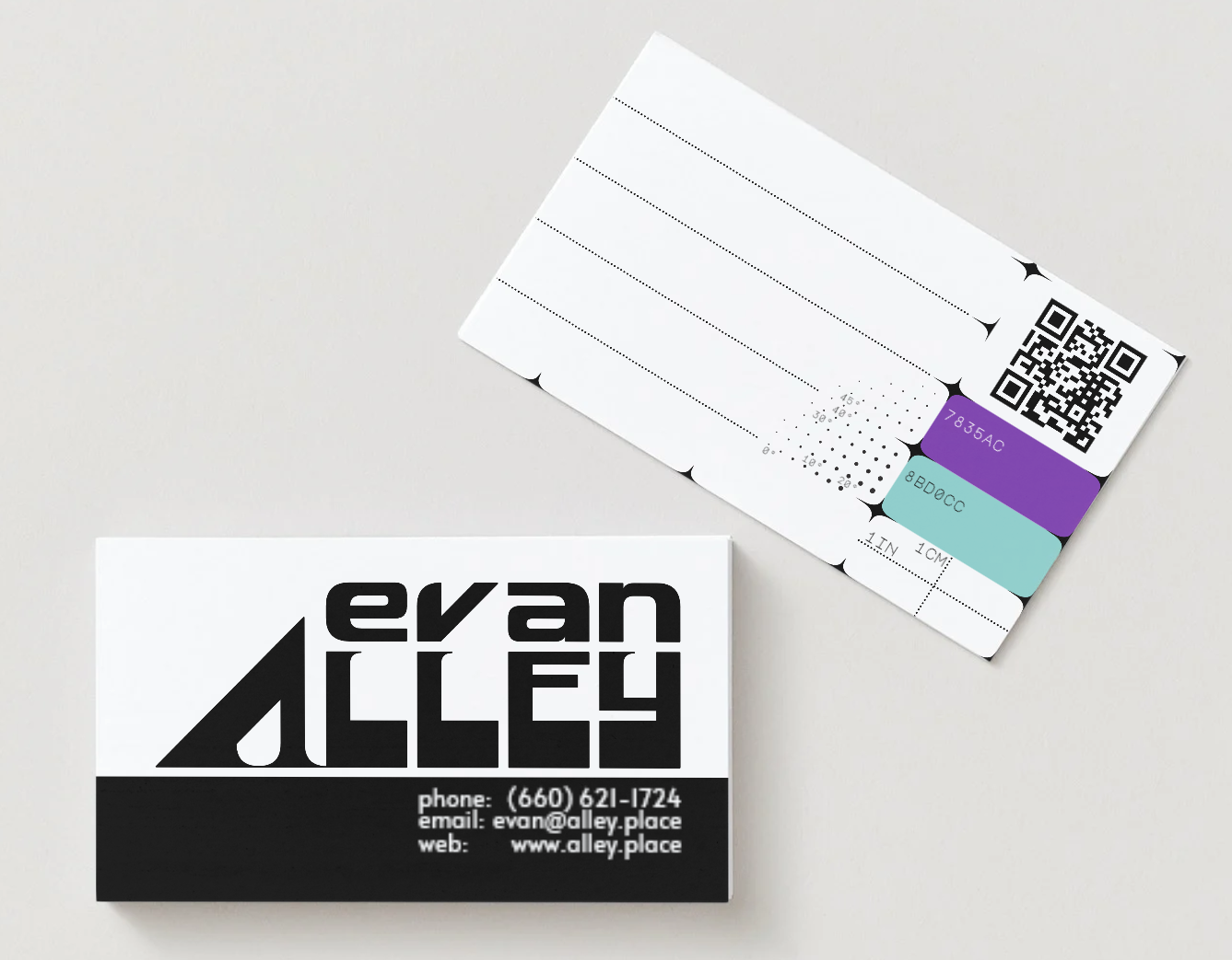
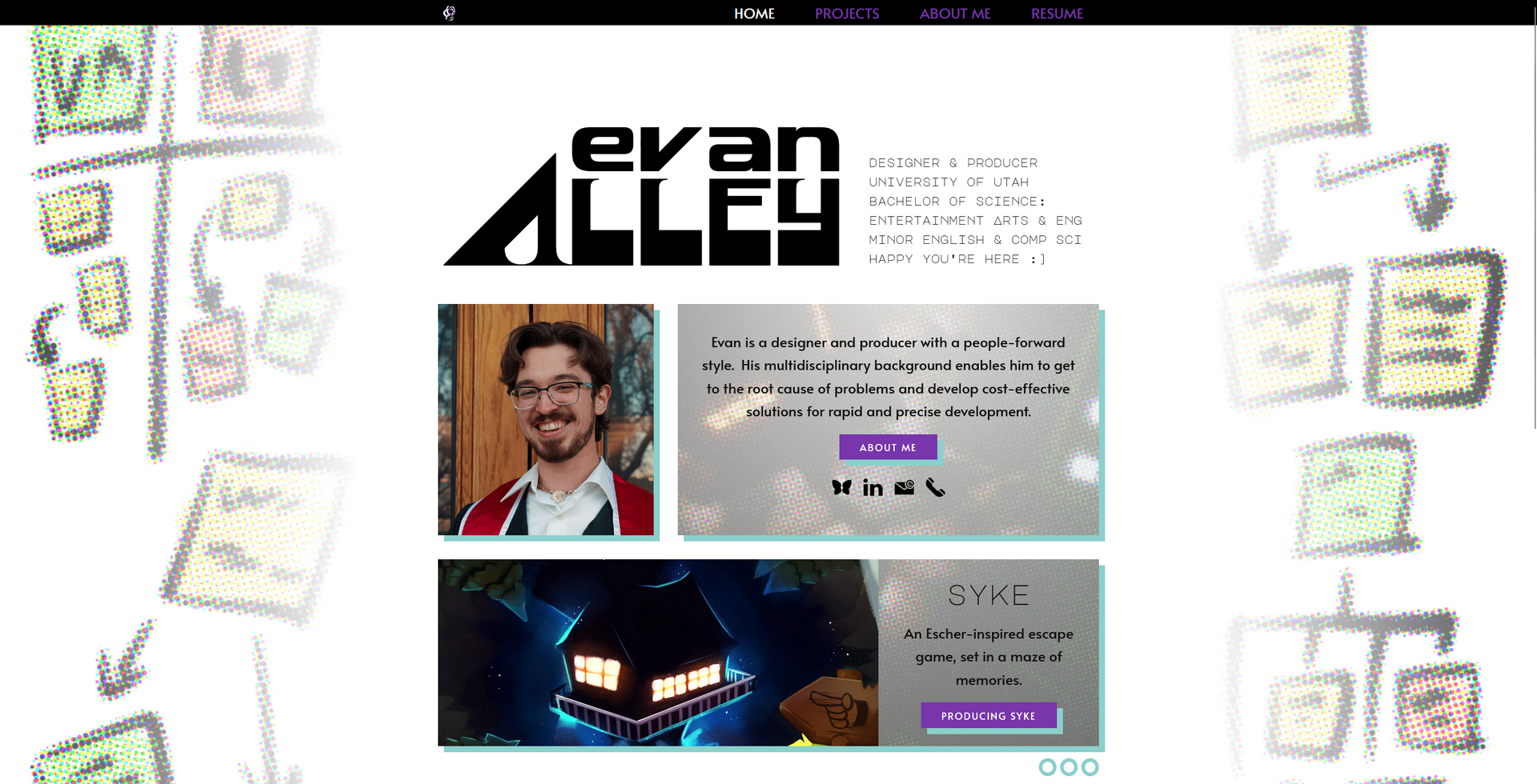
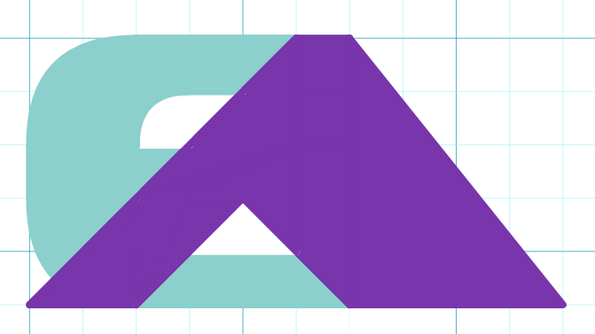
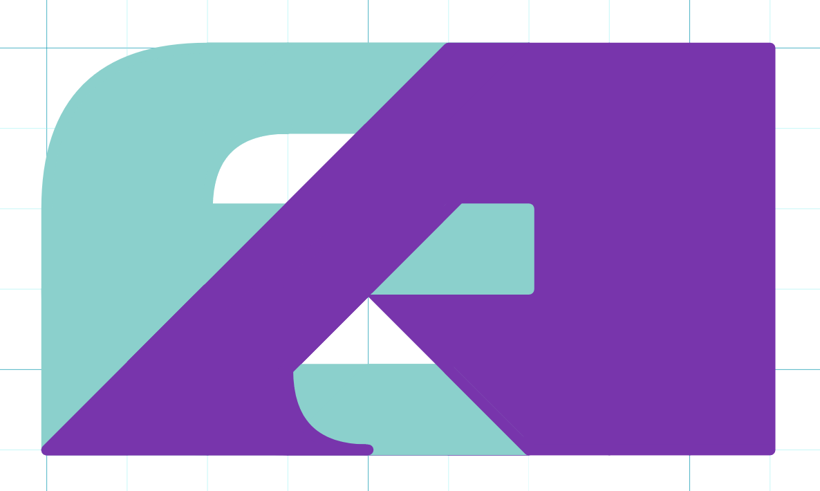
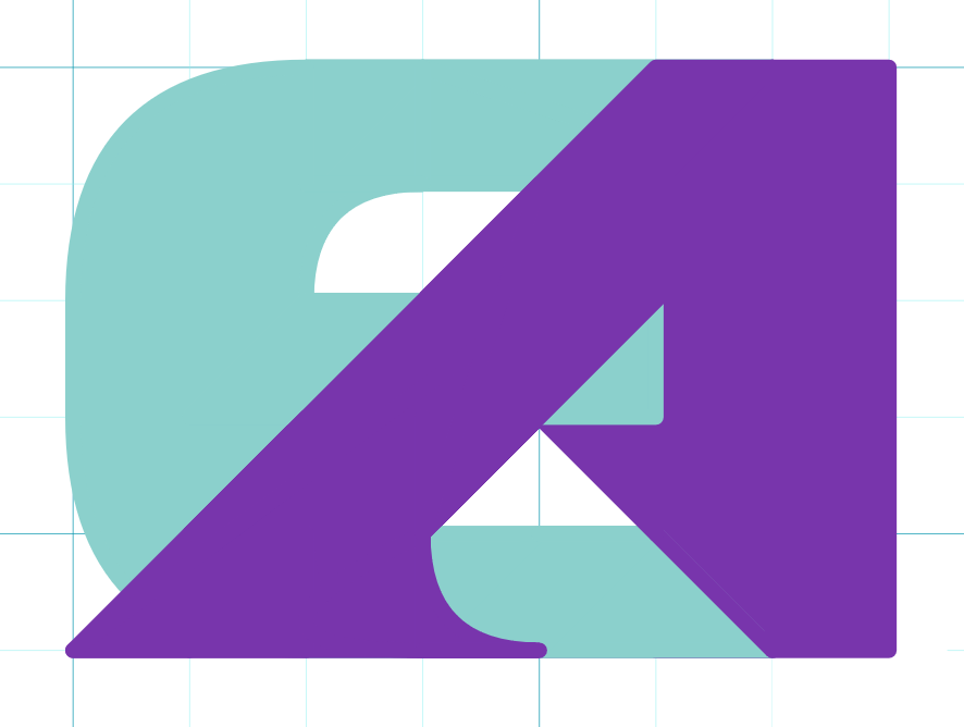
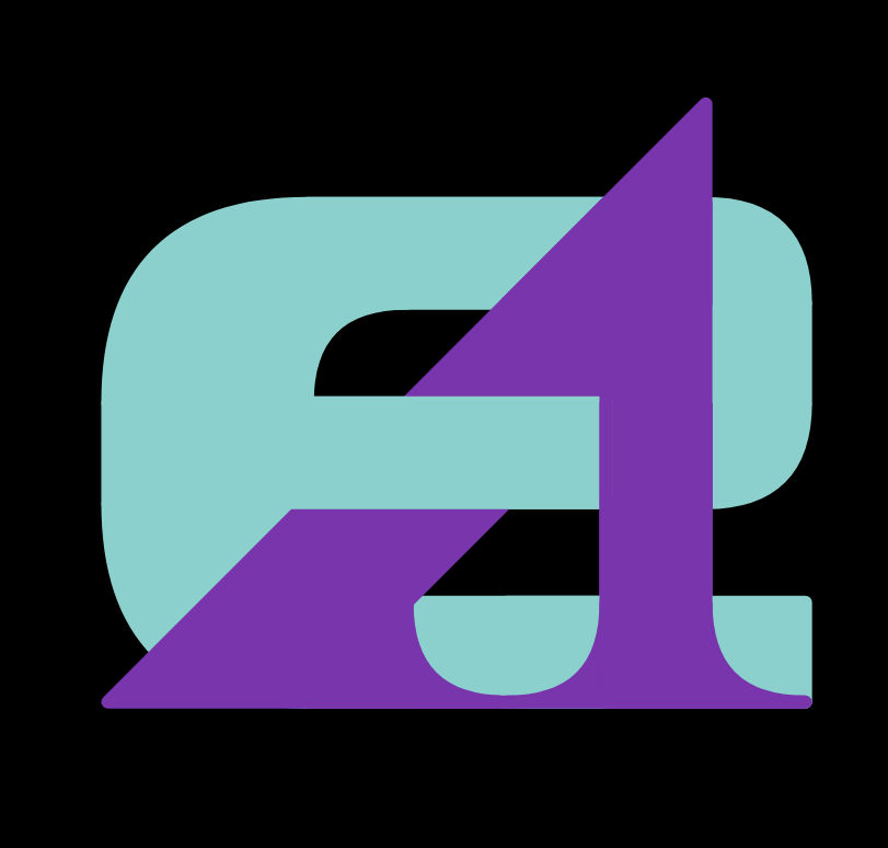
Creating an iconic lettermark has always been a bit of a nerd goal for me ever since I read The Lord of the Rings and was exposed to J.R.R. Tolkien's wicked cool lettermark. As a part of my recent brand overhaul, creating a new logo was important. Please hover over any iteration to read some of my thoughts on it! (This section is also available under "logo development")
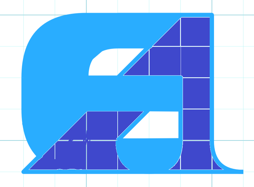
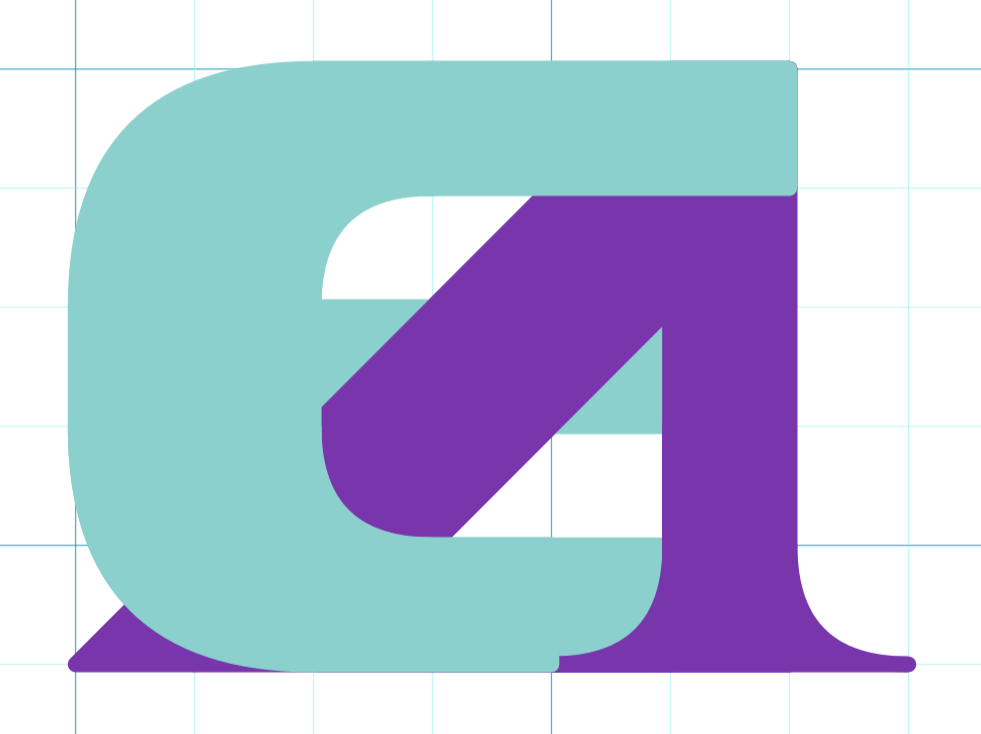
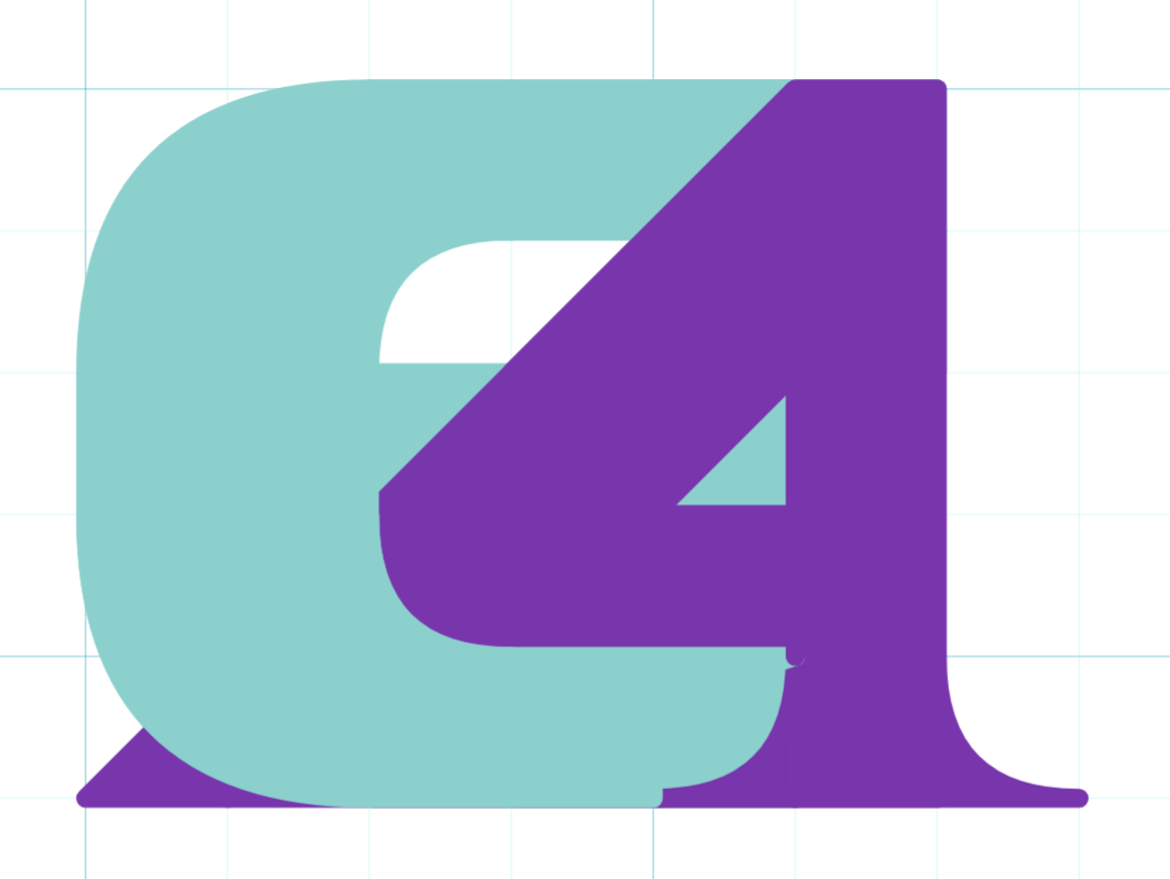
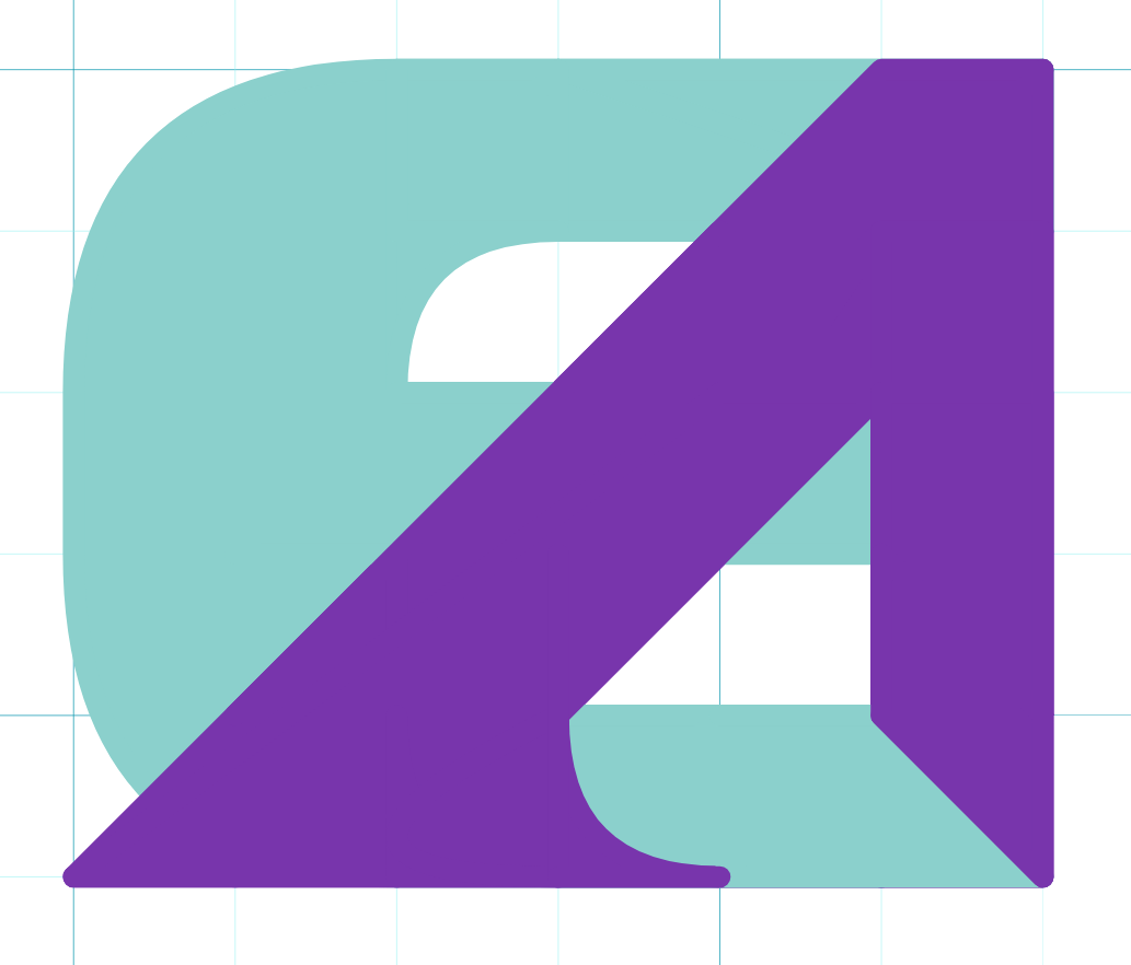
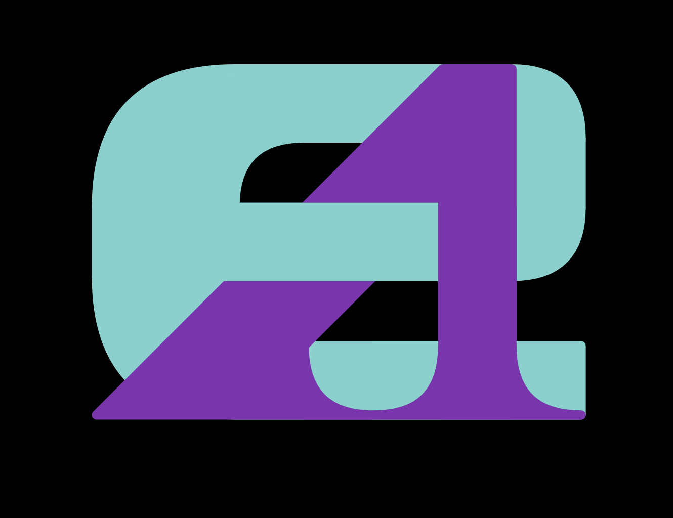

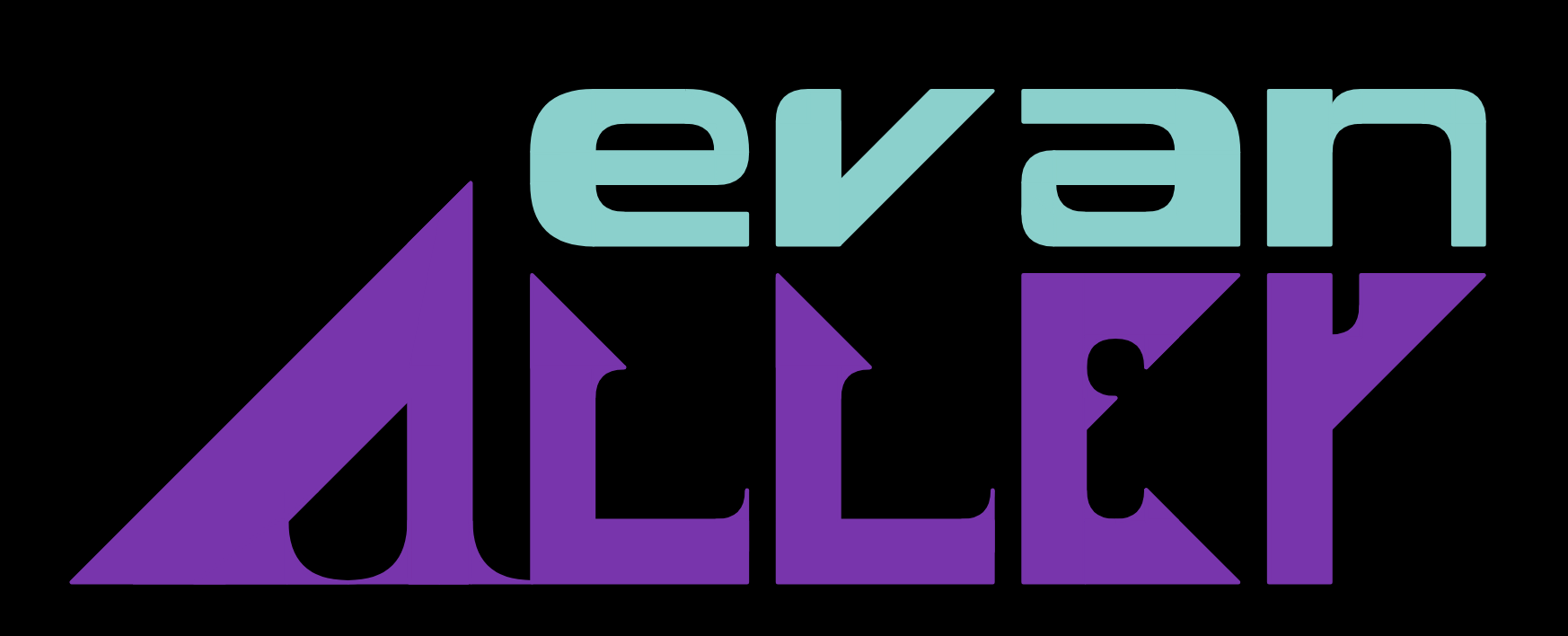
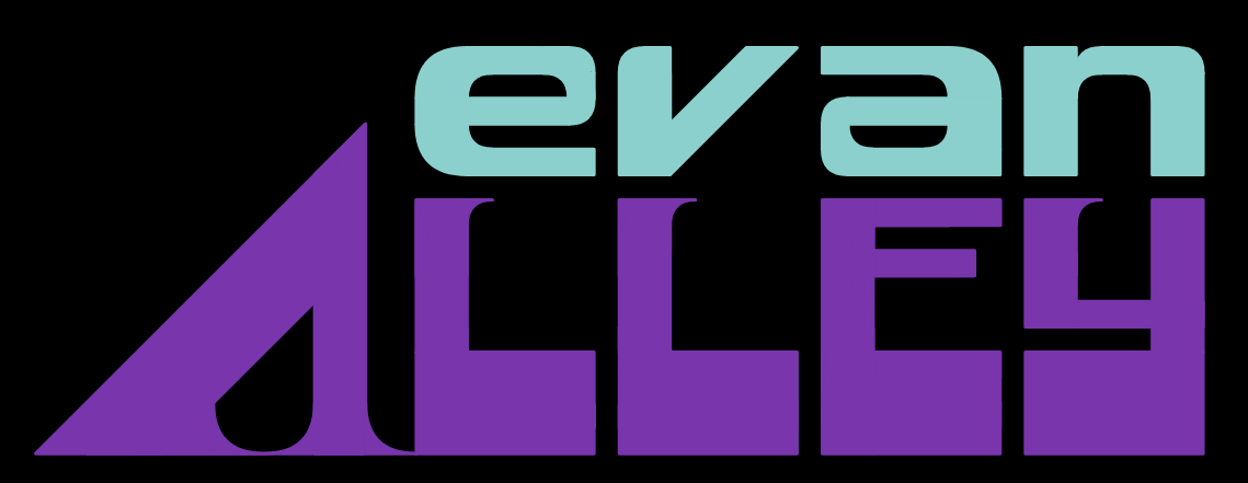
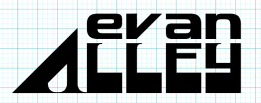
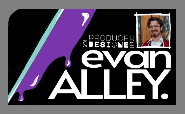
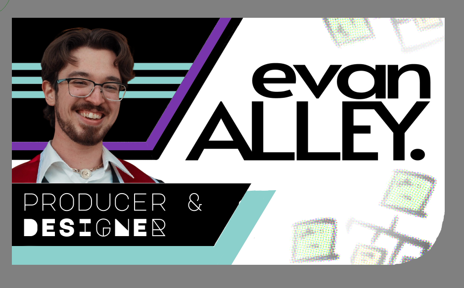
My first iteration of the wordmark was simply my name in all caps, in Alata. The iteration work on this logo can be seen below. Feedback indicated it felt like a clothing or designer brand, and this wasn't the image I was cultivating. By separating the entwined EA logo, I kept the spirit of the first wordmark - a lowercase "evan" supported by a capital "ALLEY" - while integrating it into a wider brand identity. The "evan" font was simple enough to continue from 'e' and just needed some refinement. In terms of size, 'A' was sized so that its stroke would just barely hit the stroke of 'e.' "ALLEY" needed to convey support, momentum, technology, and class. 'Y' was giving me trouble, and I was inspired by another font to try a thick baseline. This is the same thickness as the stroke of 'A.' Subtle serifs on the inside edge of the letters gives the font a touch of class and momentum, and match the serifs on 'A.'